Bilates
Responsive Web Design and Branding

This case study showcases my ability to design a top to bottom responsive website and branding platform from scratch.
Description
Former NYC Pilates instructor Bill Kerr took his classes online during the pandemic. But without a web presence his business relied upon word of mouth, emailed video links, and honor system Venmo.
The Problem
Bill lacked attendance records, spent a great deal of time sharing video links to individual clients, and longed to expand his classes.
My Role
This was a solo project that I researched and designed UX / UI for the client.
-UI Kit
-UI Design
-Usability Testing
-Final Prototype
Deliverables
-Research
-Persona
-Logo design
-Style Tile
-Sitemap
-Flowchart
-Wireframes
-Prototype
The Solution
Build a branded responsive website for Bill to offer his pilates classes to a wider clientele that allows customers to pay online before entering the video call.
The Research
Secondary research illuminated the market for virtual workouts while qualitative user interviews helped identify specifically what Bill’s clients value the most when it comes to exercising at home. Main themes identified from user interviews included:
-Desire for community and camaraderie
-Trust and expertise in the instructor
-Budget conscience
-Challenges with technology, space, and equipment

Competitor Analysis
Persona


Logo Design
My client Bill had a vision for this logo that he guided me on designing. He wanted to portray strength and flexibility, anchored by a “spine”, subtly portraying the letter “B” as well. After around 30 iterations, we were pleased with this final version.
Style Tile
I chose to keep the overall look and feel of the Bilates site largely black and white chic with the cozy brand accent colors of teal and sea foam. Photos treatments were given a down to earth desaturated photo look that blends in with the brand colors and doesn't draw too much attention to other colors.

User Flow Map
The site map shows how simplified the architecture of the Bilates site is with the central pages being clearly represented in the navigation bar.

The Wireframes
Next in the design process entailed drafting a responsive set of wireframes to layout the overall functions of the Bilates site.


The Prototype
To make sure all features functioned properly I also mapped out prototypes for each responsive design.

UI Kit
Compiling this UI Kit helped me record the style for each design element I chose for the Bilates site. I chose to keep the overall look and feel of the Bilates site largely black and white chic with the cozy brand accent colors of teal and sea foam. Photos treatments were given a down to earth desaturated photo look that blends in with the brand colors and doesn't draw too much attention to other colors.

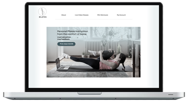
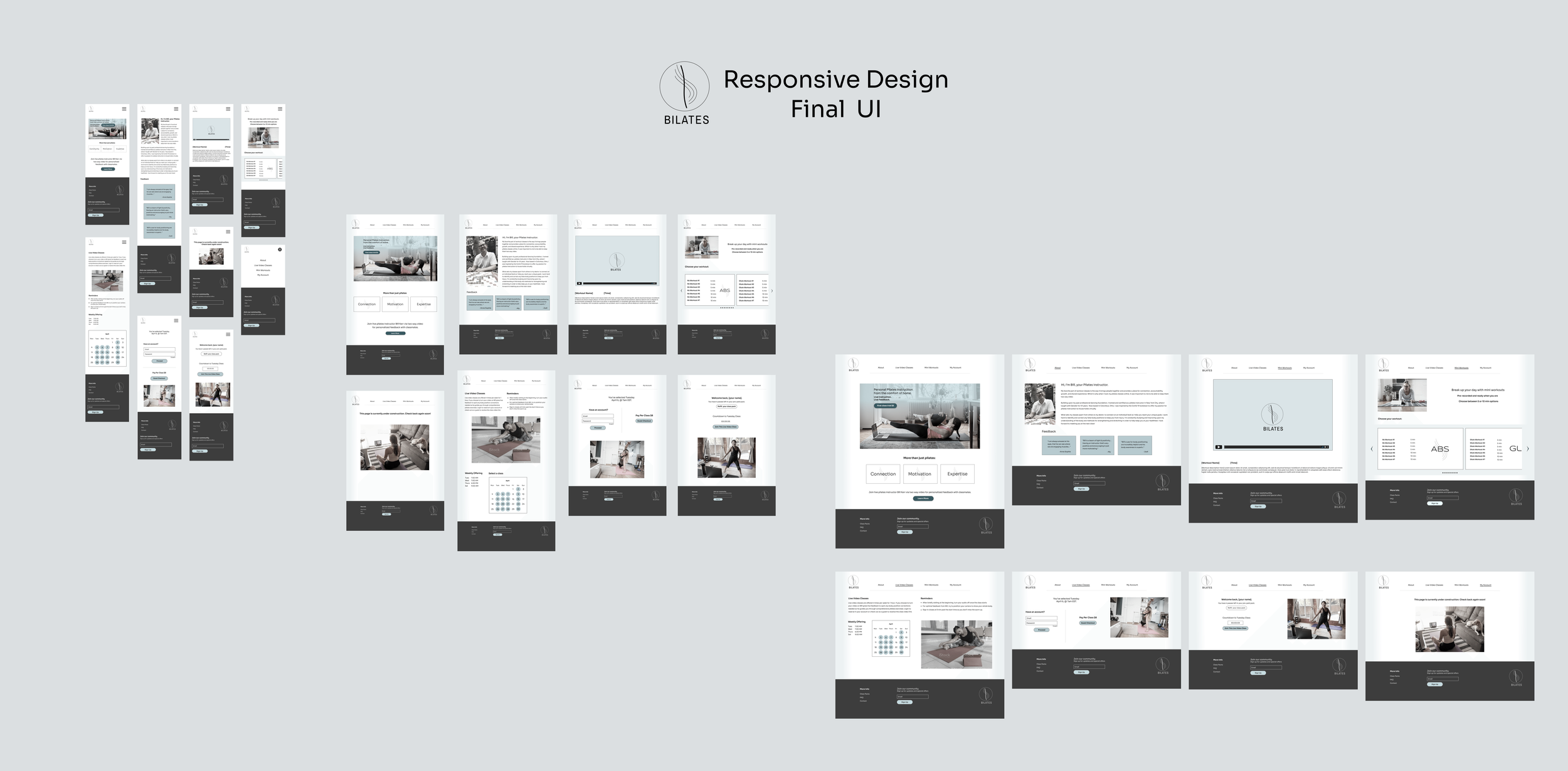
Final UI Design
Finally, I completed the responsive UI Design using all the combined UX building blocks to meet my client’s needs.
Usability Testing
Through qualitative usability testing interviews, I discovered that a calendar feature was most desired for the booking of each class, and once implemented, users very easily navigated through the task flow of signing up for a specific class.
Final Desktop Prototype
Click here to view the final prototype for Bilates Home Workouts.